Plastic surgery · Richardson & Rockwall, Texas
ConceptRegional Plastic Surgery Center
Four board-certified plastic surgeons and two offices, but a consultation started with a long form and a promise to send information.
This is a concept: a worked example of how we'd approach a practice like this, not a client project.
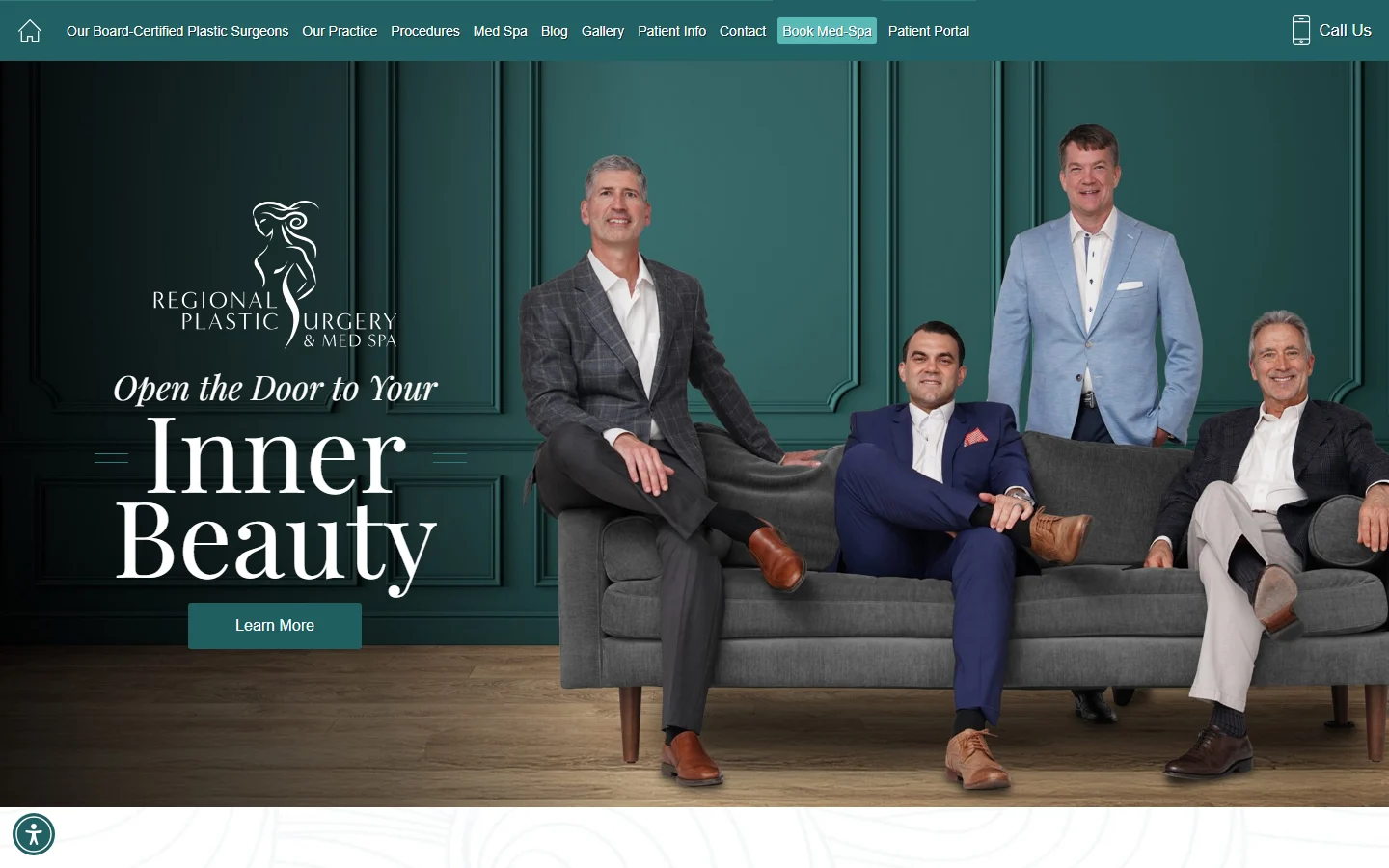
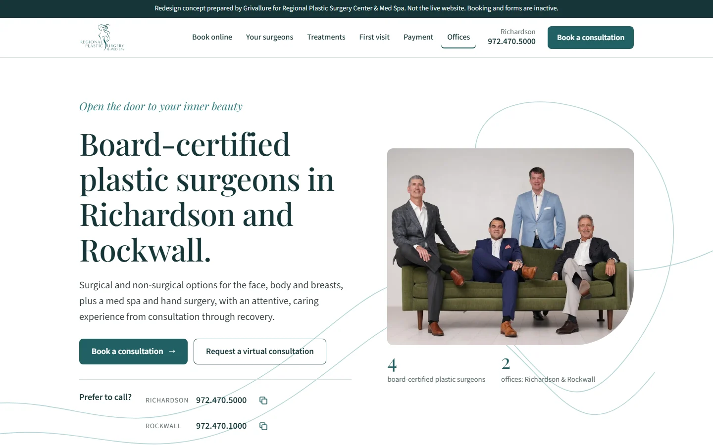
Drag the handle, or use the arrow keys, to compare.
The situation
Regional Plastic Surgery Center is a four-surgeon practice in Richardson and Rockwall, Texas, covering cosmetic, reconstructive and hand surgery, with a Skin and Laser Center med spa. All four surgeons are certified by the American Board of Plastic Surgery. Elective cosmetic surgery isn't covered by insurance, so most patients pay directly or with financing.
The website makes a strong first impression: the four surgeons, together, on the first screen, and their shared credentials on the homepage. Taking the next step is harder.
The problem
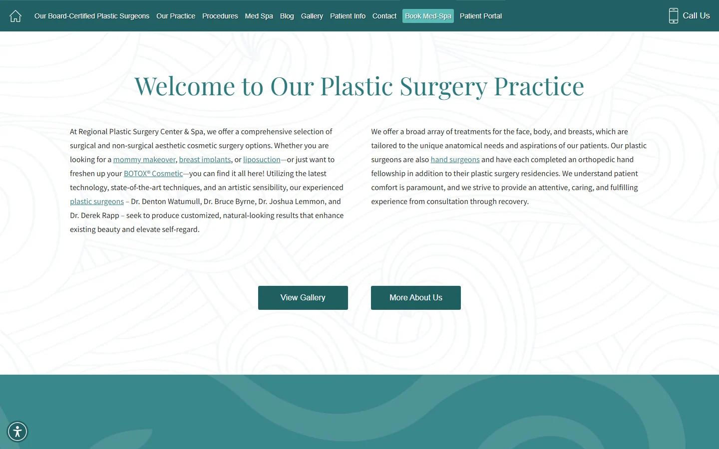
The first screen's only button was Learn More, and the one highlighted button in the menu was Book Med-Spa. A surgical consultation started from Contact in the menu, or a line at the very bottom of the page. That led to a form where a procedure, an office and a surgeon were all required, with a free-text box for more details. Afterwards the practice would "send you information". Nothing said when, or how a time would be set. Virtual consultations had their own form on another page.
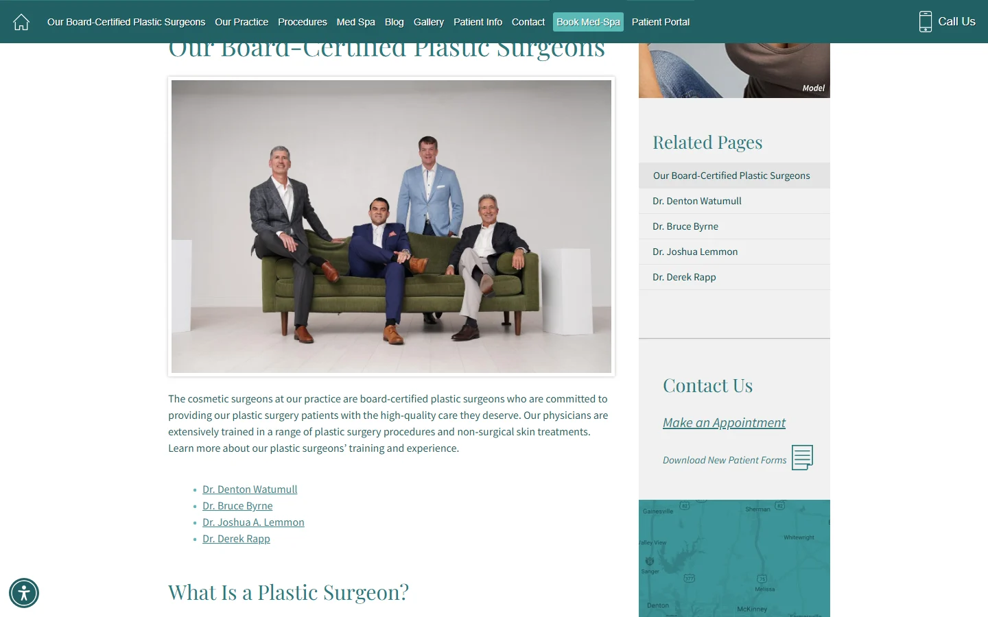
Before booking, patients also had to put the practice together from several pages. The surgeons page showed a group photo and four names, but not which surgeon works at which office; that was on the contact page. Procedures sat behind category buttons, and financing and insurance under Patient Info.
The patient's side
The same search, before and after.
Before: the old site
9:10 pm
Searches for a plastic surgeon near Richardson after work.
9:11 pm
Sees the four surgeons. The only button on the first screen says Learn More.
9:14 pm
Finds the contact form and has to choose a procedure, an office and a surgeon before sending it.
9:15 pm
Is told the practice will send information. Nothing says when, or how a time gets set.
After: the new site
9:10 pm
Searches for a plastic surgeon near Richardson after work.
9:11 pm
Taps Book a consultation on the first screen.
9:12 pm
Picks an area or Not sure yet, then Richardson, Rockwall or a virtual consultation.
9:13 pm
Requests a morning consultation. A coordinator confirms the time.
Booked
What changed
6 changes, before and after.
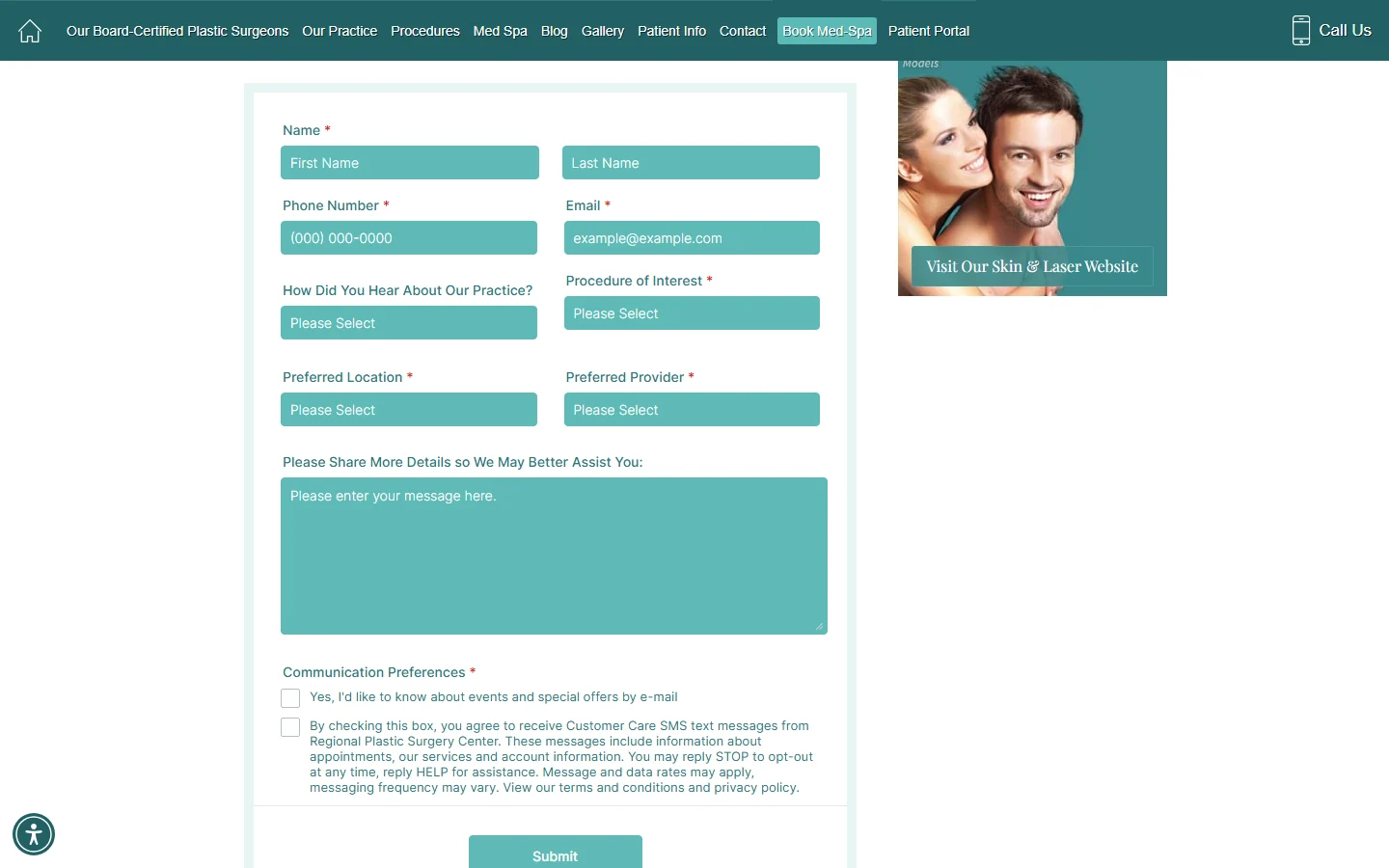
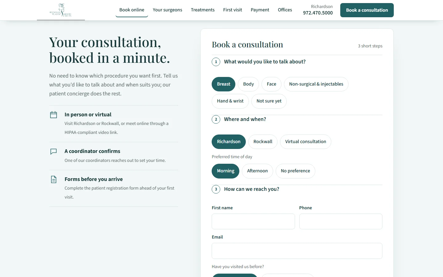
01 / 06Booking path
A consultation in three short steps
- Before
- A long contact form with a required procedure, office and surgeon, a free-text box, and a promise to "send you information". Virtual consultations had a separate form.
- After
- A booking card near the top of the page: an area or "Not sure yet", then Richardson, Rockwall or virtual, then a time of day and contact details. No medical details asked.
02 / 06Team by name
Who you'll see, and where
- Before
- The surgeons page showed a group photo and four names as links. It didn't say which surgeon works at which office; the contact page did.
- After
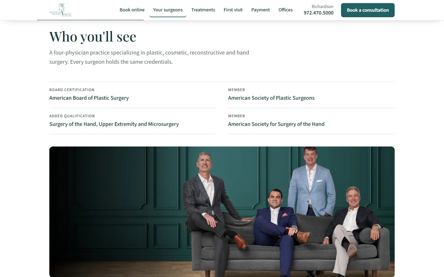
- The shared credentials, each surgeon with a portrait and their office, and the med spa nurse, esthetician and patient concierge by role.
03 / 06Treatments and consultations
Treatments that start a consultation
- Before
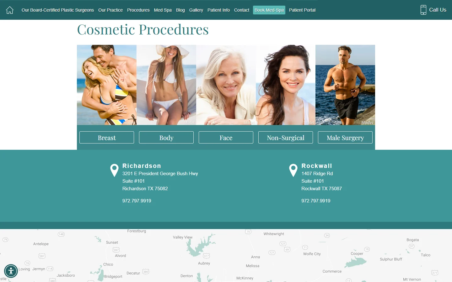
- Procedures sat behind five category buttons, each opening another page, with no way to start a consultation from the list.
- After
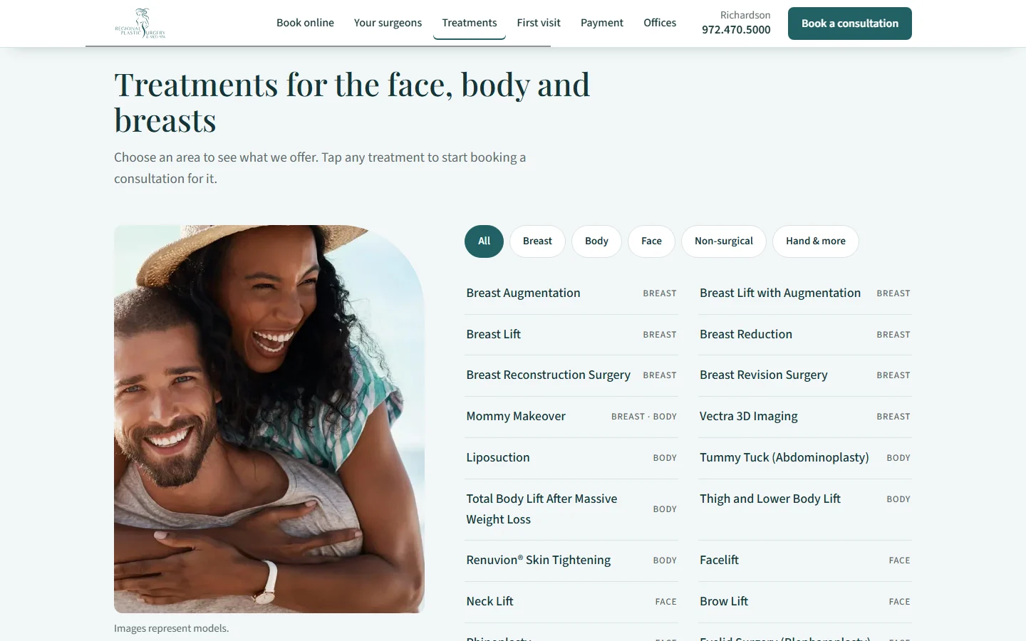
- Every treatment in one list, filtered by area. Tapping one starts a consultation request for that area.
04 / 06First visit explained
The first visit, step by step
- Before
- The homepage described the practice's approach and linked to the gallery and About page. It didn't walk through what happens at a consultation.
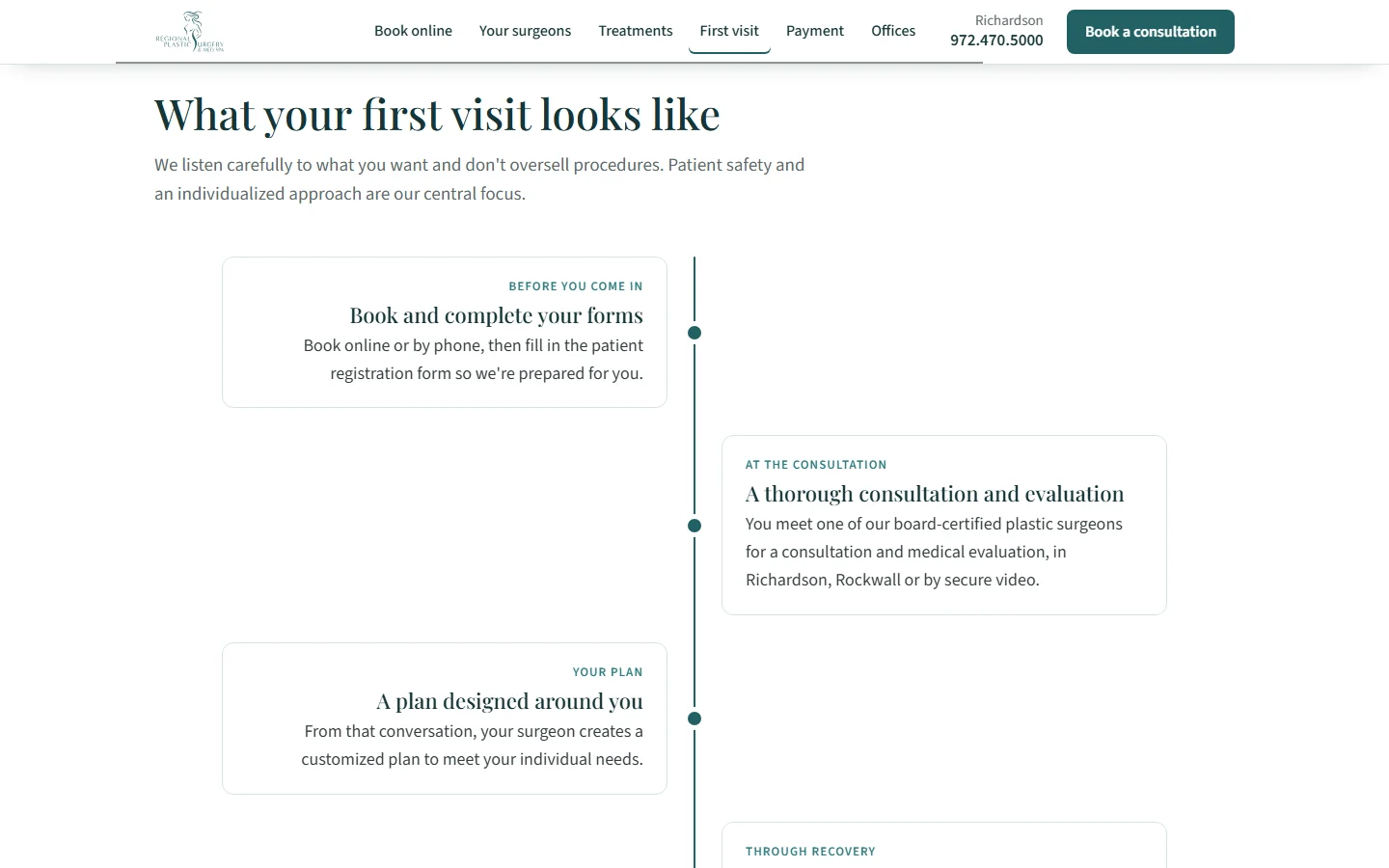
- After
- Four steps from booking to recovery: forms before the visit, the consultation and evaluation, a personal plan, and care after surgery.
05 / 06Payment explained
Payment answered on the page
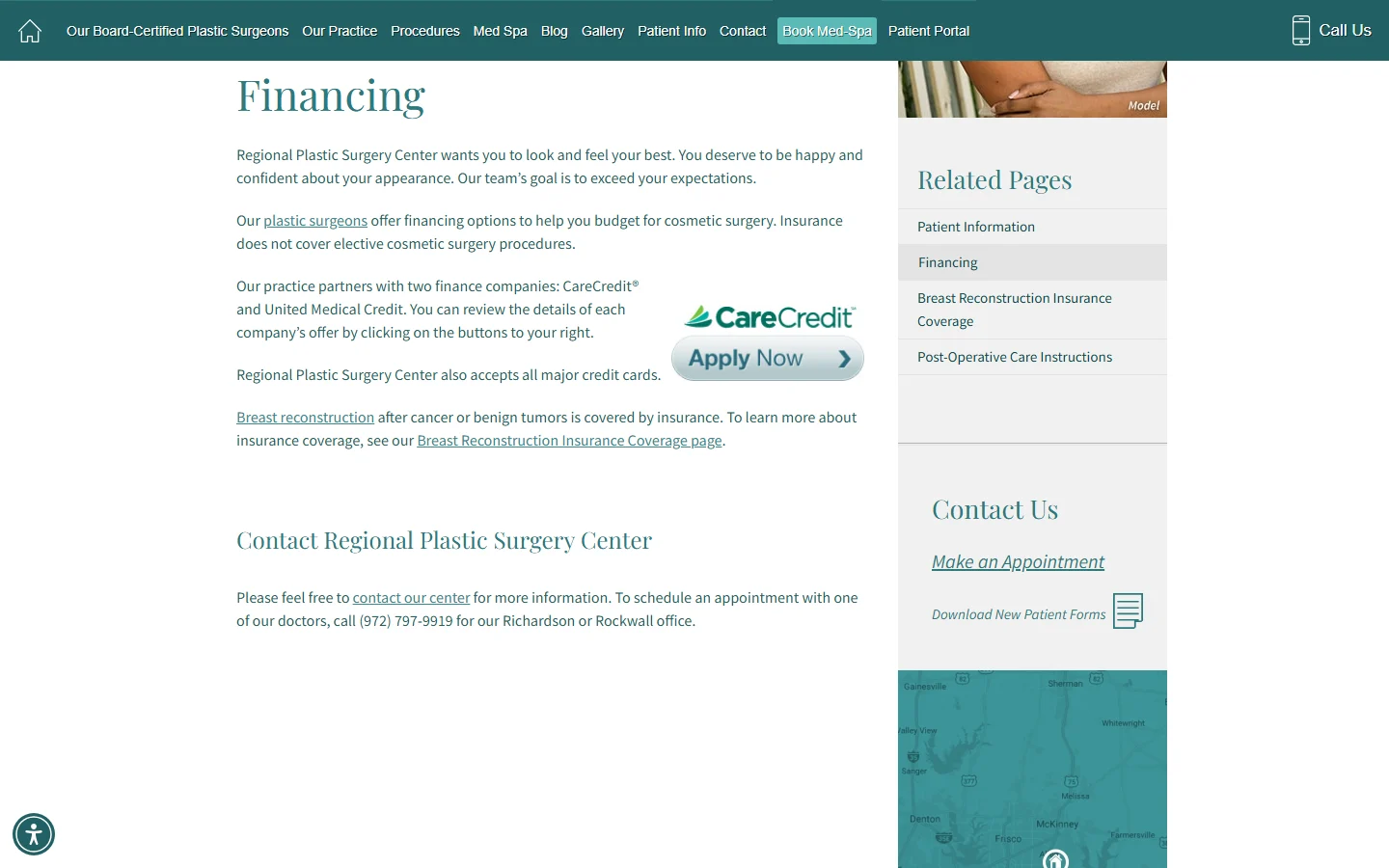
- Before
- Financing, credit cards and insurance sat on a Financing page under Patient Info, with breast reconstruction coverage on another page.
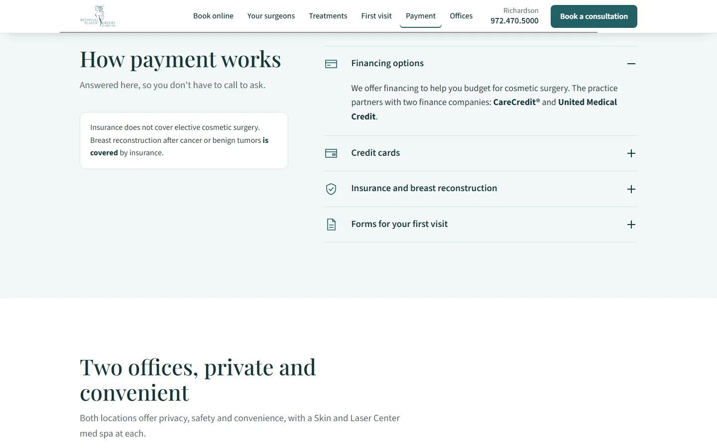
- After
- One section with the financing partners, credit cards, what insurance does and doesn't cover, and the forms for the first visit.
06 / 06Locations
Two offices, and who works at each
- Before
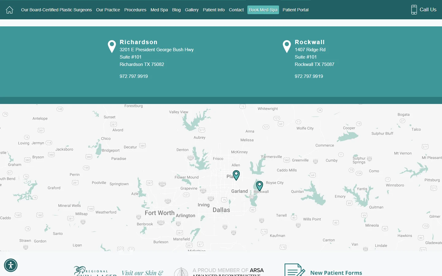
- The office blocks gave an address and the same phone number for both offices, with no sign of which surgeons work where.
- After
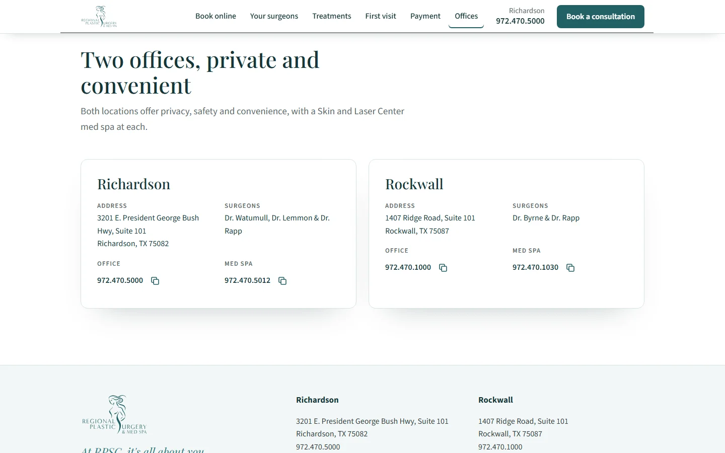
- Each office with its address, its surgeons, and its own office and med spa numbers.
01 / 06Booking path
A consultation in three short steps
- Before
- A long contact form with a required procedure, office and surgeon, a free-text box, and a promise to "send you information". Virtual consultations had a separate form.
- After
- A booking card near the top of the page: an area or "Not sure yet", then Richardson, Rockwall or virtual, then a time of day and contact details. No medical details asked.
02 / 06Team by name
Who you'll see, and where
- Before
- The surgeons page showed a group photo and four names as links. It didn't say which surgeon works at which office; the contact page did.
- After
- The shared credentials, each surgeon with a portrait and their office, and the med spa nurse, esthetician and patient concierge by role.
03 / 06Treatments and consultations
Treatments that start a consultation
- Before
- Procedures sat behind five category buttons, each opening another page, with no way to start a consultation from the list.
- After
- Every treatment in one list, filtered by area. Tapping one starts a consultation request for that area.
04 / 06First visit explained
The first visit, step by step
- Before
- The homepage described the practice's approach and linked to the gallery and About page. It didn't walk through what happens at a consultation.
- After
- Four steps from booking to recovery: forms before the visit, the consultation and evaluation, a personal plan, and care after surgery.
05 / 06Payment explained
Payment answered on the page
- Before
- Financing, credit cards and insurance sat on a Financing page under Patient Info, with breast reconstruction coverage on another page.
- After
- One section with the financing partners, credit cards, what insurance does and doesn't cover, and the forms for the first visit.
06 / 06Locations
Two offices, and who works at each
- Before
- The office blocks gave an address and the same phone number for both offices, with no sign of which surgeons work where.
- After
- Each office with its address, its surgeons, and its own office and med spa numbers.
The result
The redesign is a concept prepared for the practice and isn't live, so there are no results to report. What it changes for patients: requesting a consultation is the first thing on the page, takes three short steps, and doesn't ask them to choose a procedure or a surgeon before they've met one. In person or virtual is one choice in the same place.
For the coordinators, requests arrive with the area, the office and a time of day already chosen. If it goes live, we would agree with the practice how to measure it from its own records, for example consultation requests made in the evening.
Your free Patient Experience Audit
See what a new patient sees.
An audit that follows a new patient from the search result to your booking page and shows where they give up, plus a redesign concept of your homepage that shows the fix. Delivered within 48 hours. No pitch.
Free · Audit + homepage concept in 48 hours · No pitch